Brand Systems
Swiftly
Swiftly Icon System
Creative Direction // Karli Lundquist
Execution // Barbara Olivera, Suzanna O’Neill

TL;DR
Twenty inconsistent icons with no rules, no documentation, and no room to grow. We rebuilt it from the ground up with a flexible system, now 100 icons strong and built to scale.
The Brief
When I joined Swiftly, one of my first tasks was a full audit of the brand. The icon system stood out immediately — 20 icons with inconsistent styles, no documentation, and no clear rules for expansion. I scoped it as a standalone project and built the team process around solving it right.
The Problem With the Old Icons
-

Lacking Refinement
The original icons were blocky and visually heavy — they lacked the craft and polish expected of a modern product. Individually they were functional, barely. Together they felt unfinished.
-

Inconsistent Across Sizes
Icons that looked passable at large sizes broke down completely at smaller ones. Stroke weights, proportions, and details weren't designed to a grid, meaning the set couldn't be trusted at the sizes the product actually needed.
-

No System, No Rules
There was no documentation, no style guide, and no rules for adding new icons. Every addition was a guess, which is how 20 icons became 20 different opinions about what an icon should look like.
The Approach
I started by writing a brief and establishing a timeline with two designers, two directions. One explored a more illustrative approach; the other focused on a clean, refined icon system. After evaluating both, the illustrative direction was ruled out in favor of something more versatile and true to Swiftly's visual language.
Before jumping into execution, I had the team study existing icon systems that matched our aesthetic direction and recreate four icons from the original set. It was a deliberate onboarding step that helped the designers understand how icons are built before building net new ones.
The final system draws from two established references with a handful of bespoke icons created specifically for Swiftly's product offerings. The result is a system that feels native to the brand, not borrowed from it.
The Work

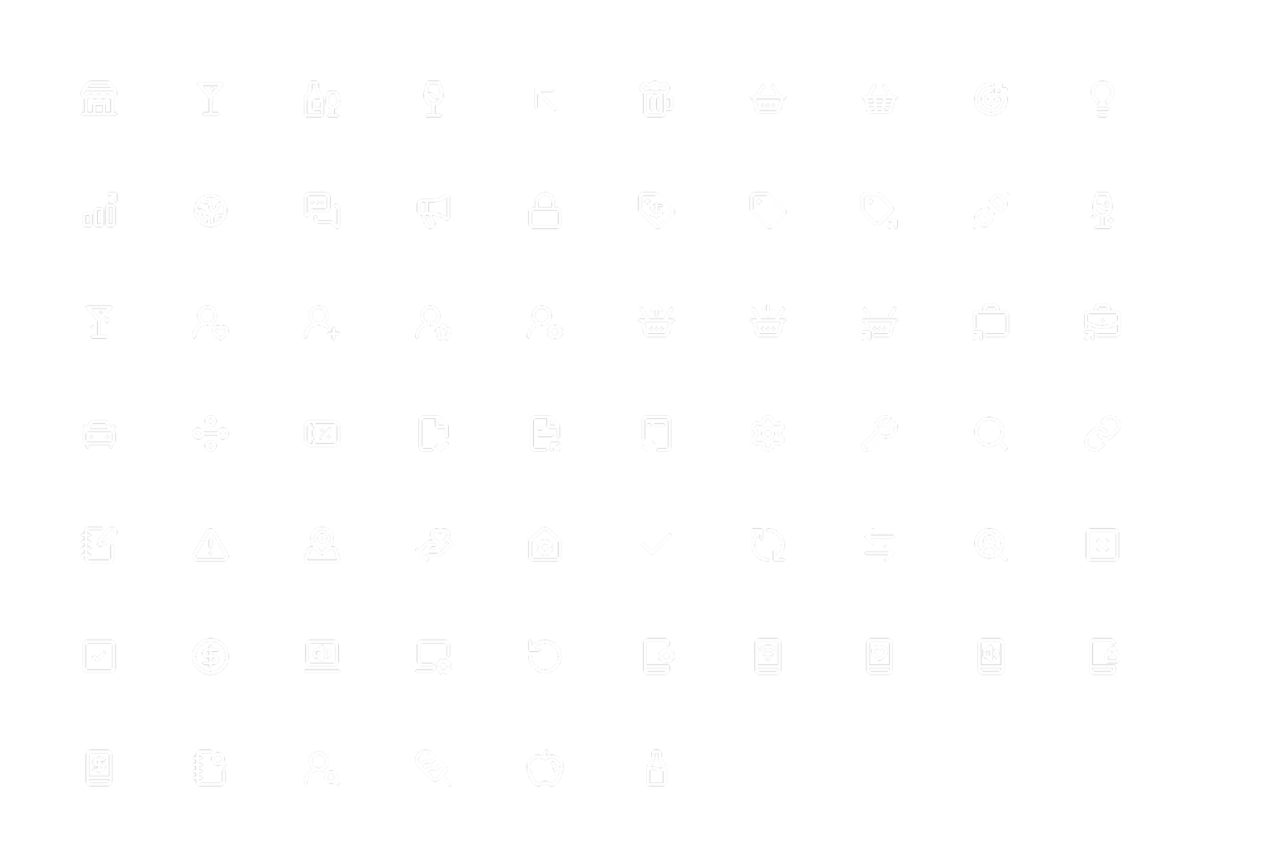
Set of Product-Centered Icons
The Outcome
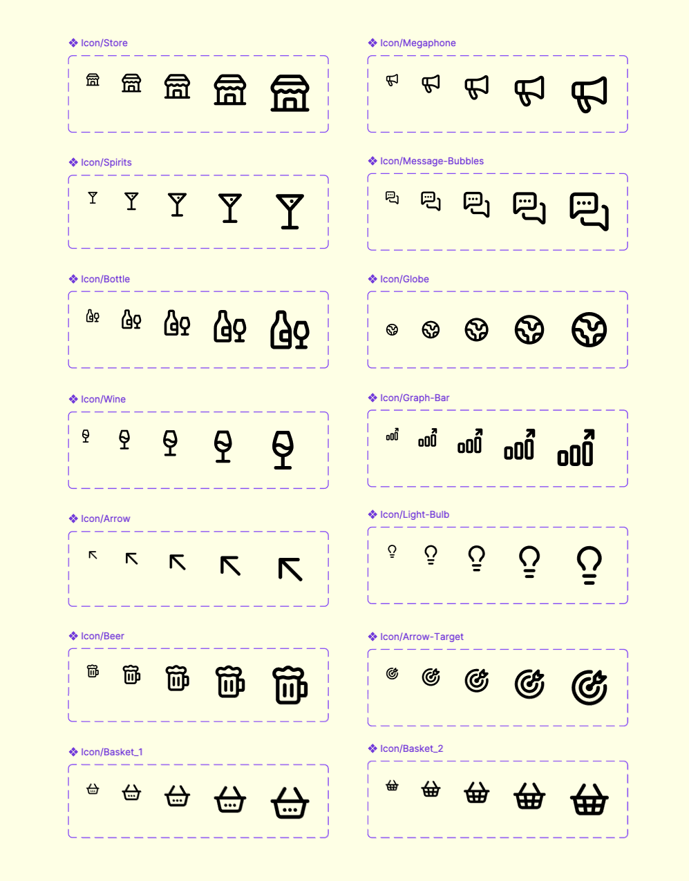
The result is a system anyone on the team can build from. New icons can be created and added without a single designer owning the process — the rules are documented, the patterns are established, and the bar is set.
Every icon now lives in a Figma component library, giving designers a single source of truth that has meaningfully sped up workflow and brought consistency to every project that touches the brand.