Web Design
Swiftly
Swiftly Website Refresh
Creative Direction // Karli Lundquist
Execution // Karli Lundquist, Crystal Correra, Barbara Olivera, Mariano Zambelli
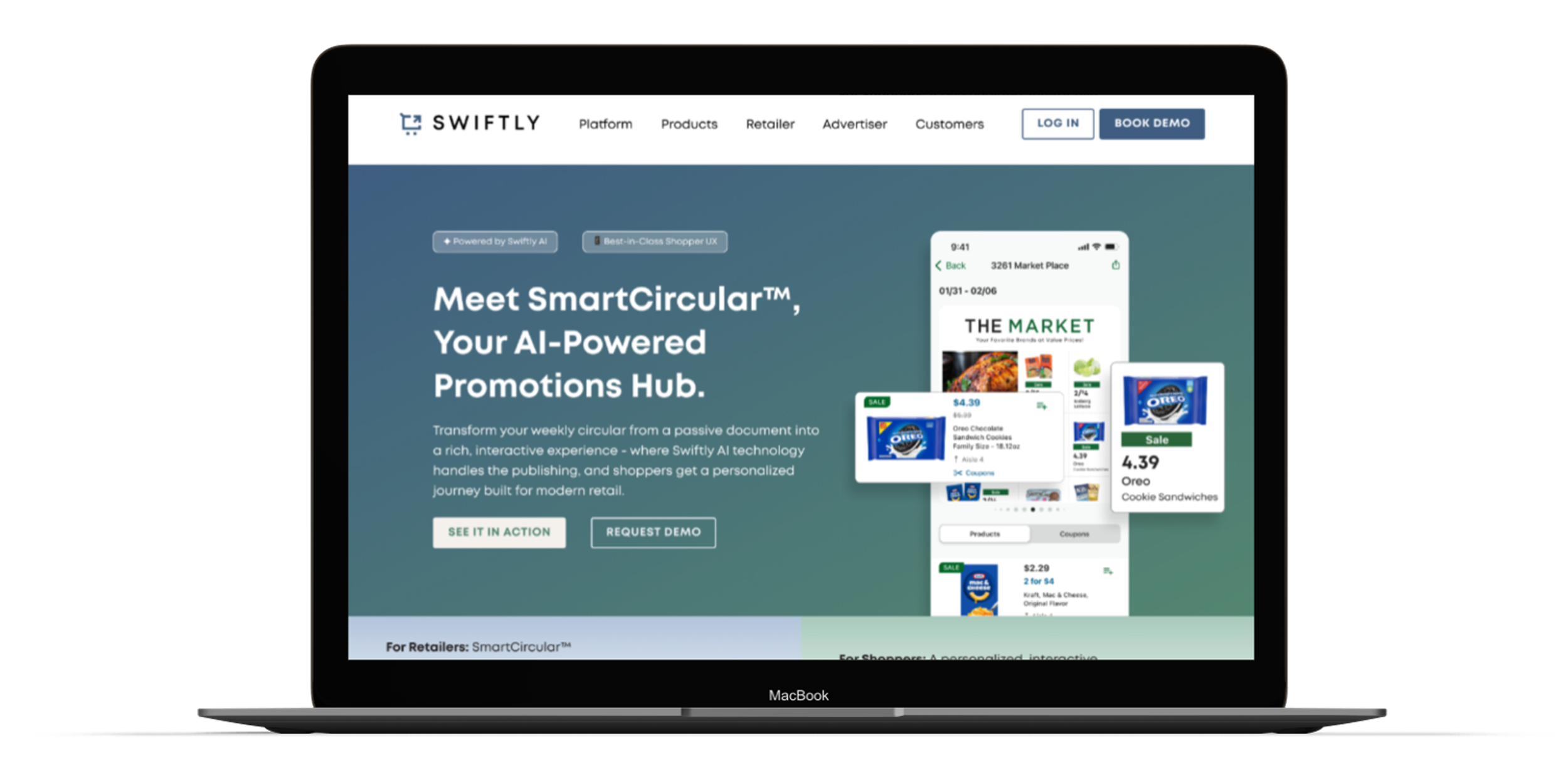
TL;DR
Fragmented ownership, disjointed modules, and a visual language that had drifted over time. We cut through the noise, rebuilt the system from updated brand guidelines, and gave the site room to breathe with a surprise-and-delight moment on every page.
The Brief
Swiftly's site had undergone a redesign and several rounds of updates, but without clear creative ownership, each pass left it a little more fragmented than before. The ask was to simplify, cleaner layouts, clearer messaging, with a more modern visual feel while staying within existing brand standards and building within the team's Webflow capabilities. The timeline: three weeks. No external dev support. Just the internal creative team and many stakeholders to align with.
The Problem
-
Fragmented by Committee
Multiple teams, differing feedback, and ambiguous ownership had left the site with disjointed modules that didn't flow or tell a coherent story. No single page felt intentional from top to bottom.
-
Visuals Without a System
Graphics and visual treatments had been added piecemeal over time rather than pulled from a unified direction. The result was a site that felt assembled, not designed.
-
Bulky and Hard to Read
Heavy modules crowded the content instead of supporting it. What Swiftly does and why it matters wasn't coming through clearly enough for a first-time visitor to grasp quickly.
The Approach
Before a single page was touched, the team redefined Swiftly's brand guidelines. We updated how core colors were used and established a more modern, tech-forward visual language. That foundation was the prerequisite. Without it, any refresh would have just layered new problems on top of old ones.
From there, I set the page standard with the SmartCircular product page, establishing the layout logic, color application, and module rhythm that every subsequent page would follow. Building one page right first meant the rest of the site had something to align to, rather than continuing to drift.
Animation and motion were heavily emphasized in discovery calls, so working with a video specialist to bring static graphics to life was a must. In addition to animated graphics, we added subtle hover interactions on every page. The goal wasn't flash, it was depth. Every surprise-and-delight moment was designed to reward attention rather than demand it.

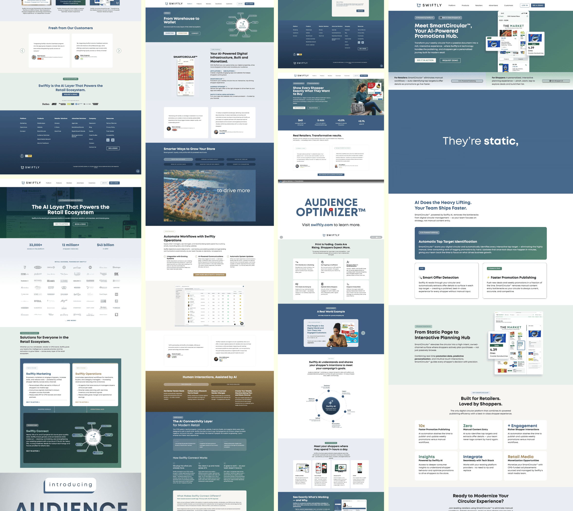
The Work
The Outcome
The refreshed site trades bulk for clarity with fewer modules, more meaningful visuals, and a narrative that flows from section to section rather than stopping and starting. Content has room to breathe, and Swiftly's products are easier to understand at a glance than they've ever been.