Website Design
United Credit
United Credit Website
Art Direction & Design // Karli Lundquist
Copy // Emily Doenges
TL;DR
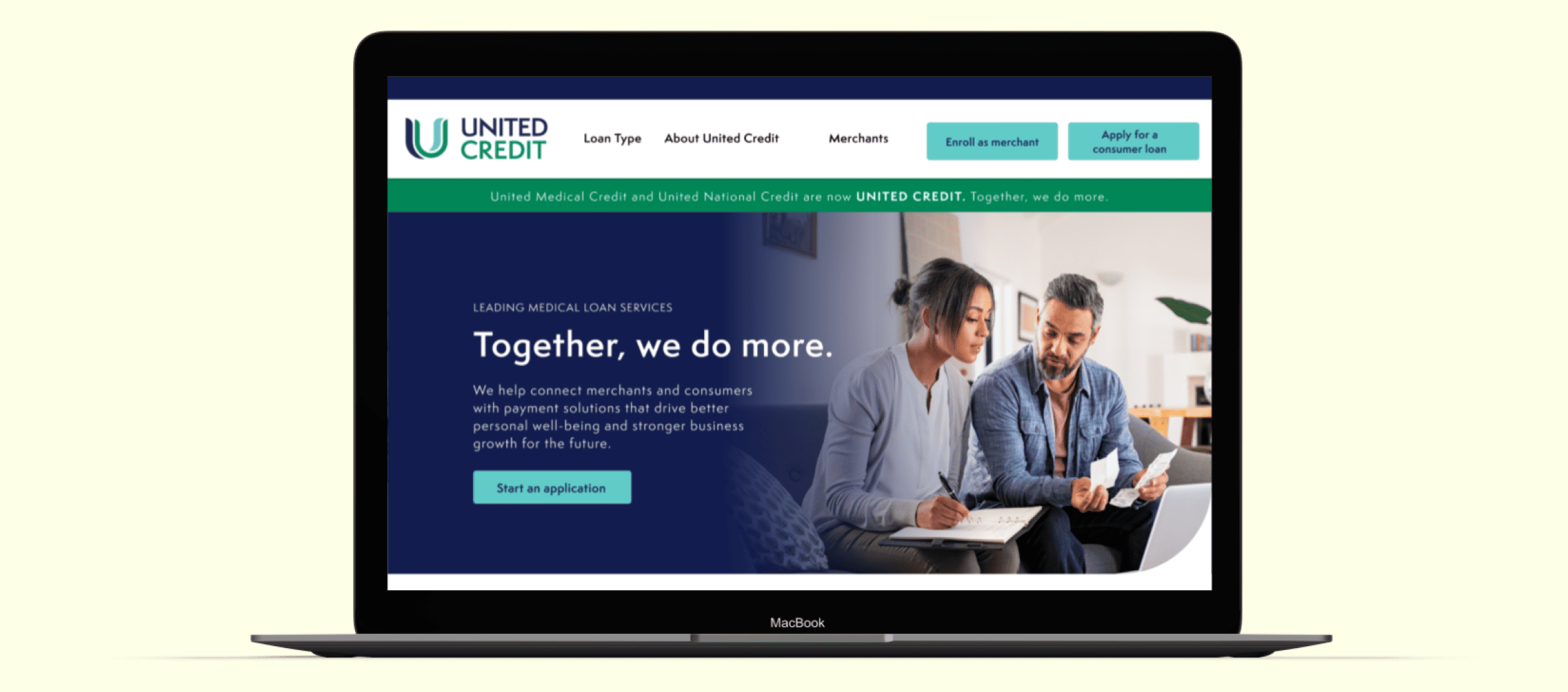
A logo, a color palette, a stack of content docs, and a blank canvas. United Credit needed a website built from scratch after a merger, so I worked to build the brand look and feel alongside the web design.
The Brief
Following a merger, United Credit needed a new website that could represent the combined company and its full range of funding solutions. There was no existing site to redesign, just a new logo, a starting color palette, and a lot of complex financial content that needed to feel clear and trustworthy to potential customers.
The Problem
-
Brand Built From Scratch
With only a logo and some colors to work from, the visual language of the brand. How it felt, how it moved, and what made it recognizable needed to be defined from the ground up.
-
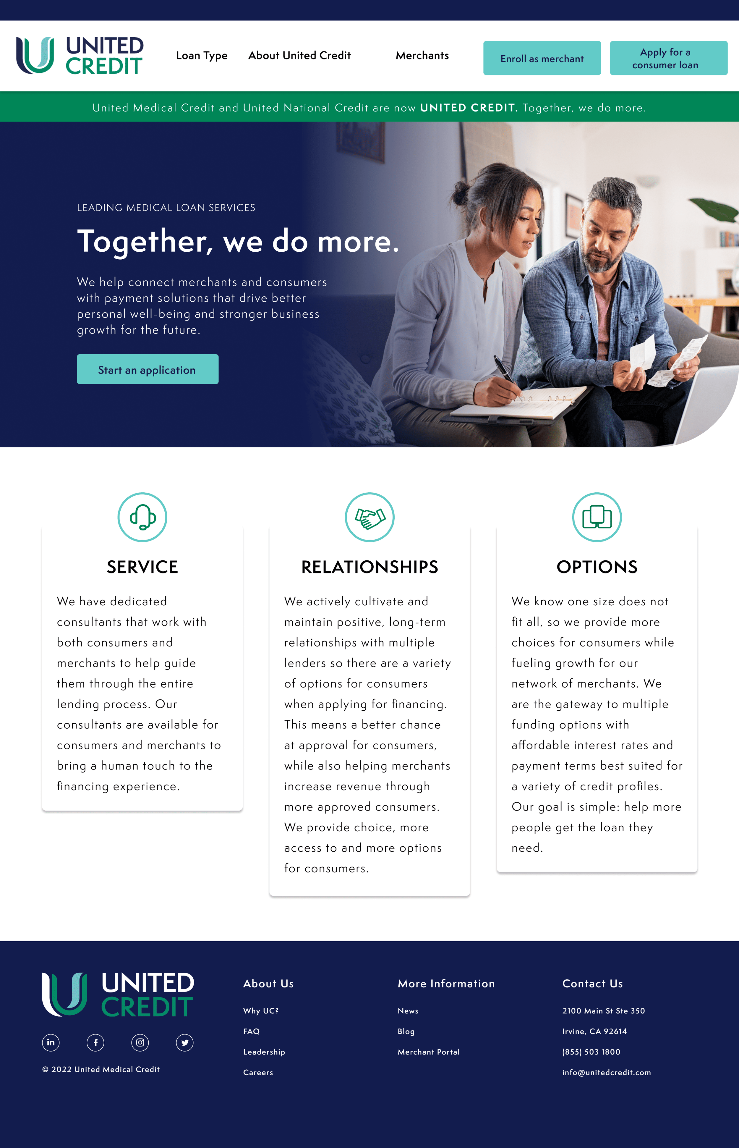
Content Heavy, Clarity Critical
Financial services sites live or die on trust. The content was dense and the product offering broad, making it digestible without dumbing it down was a core design challenge.
-
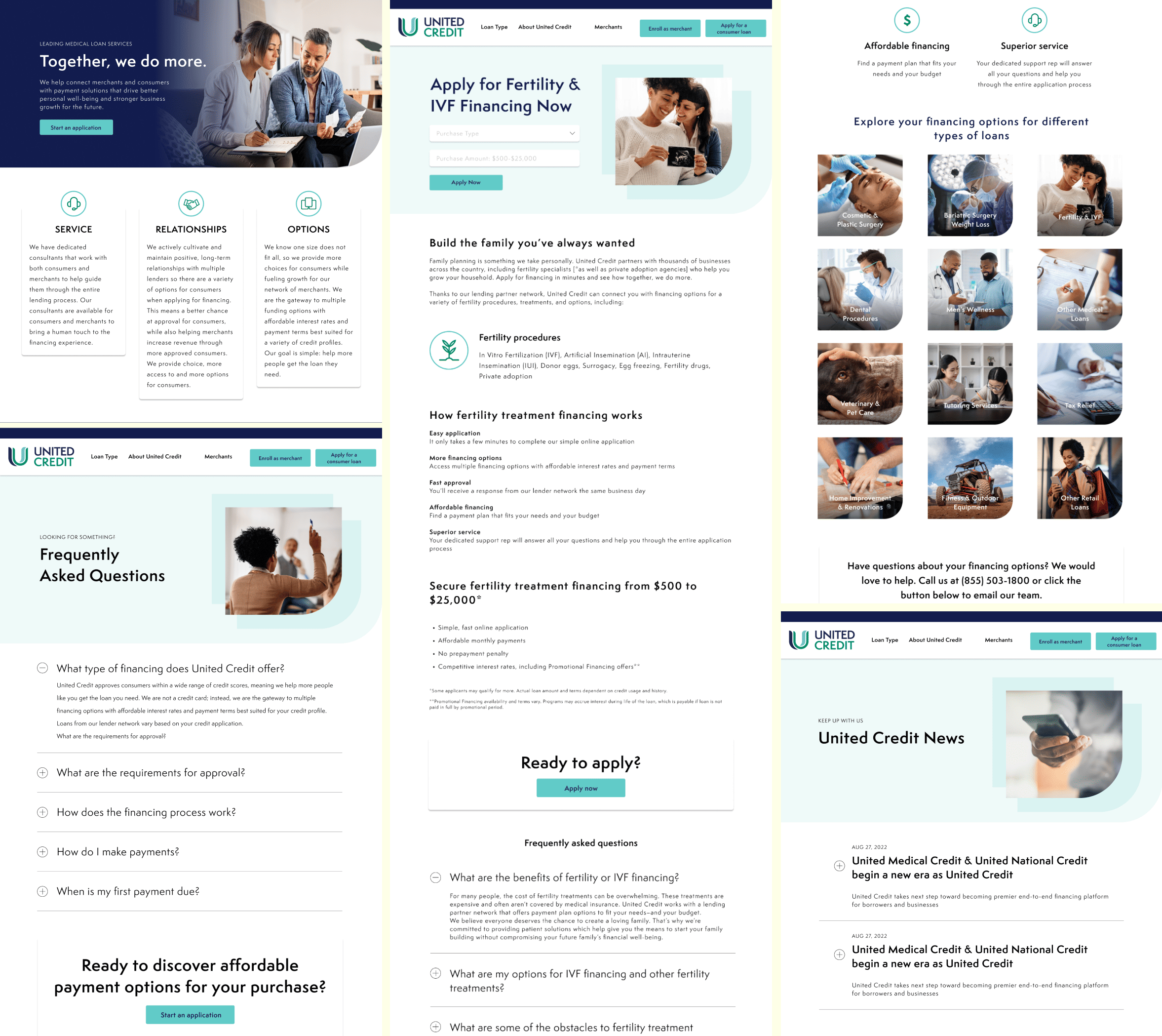
Finding the Right Funding Solution
United Credit serves multiple audiences looking for different things. The site needed a user journey that got the right person to the right solution without friction.
The Approach
With significant creative freedom and minimal brand foundation to constrain me, I started by finding the visual signature that would make United Credit recognizable. I pulled it directly from the logo, the curve of the "U", and developed it into a repeating graphic device used across the site as a brand treatment. Something that felt native to the identity rather than decorative on top of it.
From there, the design system extended outward to typography hierarchy, layout grid, and component patterns, all built to handle a high volume of content without the site feeling overwhelming. I collaborated with a copywriter to shape the messaging in parallel, so the visual and written voices developed together rather than one chasing the other.
The navigation and page structure were designed around the user's goal of finding the right funding solution, rather than the company's org chart. Getting that hierarchy right was as much a design decision as any visual one.
The Work
The Outcome
United Credit launched with a complete web presence and a visual identity to match, built from a logo and a color palette into a full brand expression. The site is live, with a Figma prototype available for a closer look at the interaction design decisions.
The curve device became the brand's visual signature, a detail that started in the logo and ended up as the thread connecting the entire site.